


Seigaiha and Stamp Carving
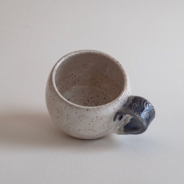
I got my whale tattoo a couple of years ago, and it has inspired the name of the ceramics line. But even before the ceramics line, I knew I wanted the whale to remind me to slow down and take the time to be in awe.

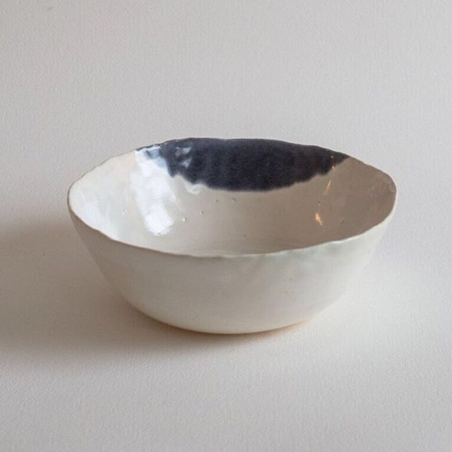
Image from Etsy
I’m very methodical (surprise), so of course, it was a long process to figure out (1) what tattoo I wanted, (2) what design elements would be incorporated, and (3) what each would represent. Florence Broadhurst has been the force behind my tattoos, inspired by her work with wallpaper design and her life as an absolute enigma. (Read the TINSEL post; she’s a strange bird.) She has done an incredible job taking inspiration from Japanese patterns, art-deco patterns, and using them to create something fresh and striking throughout her wallpaper work.
Enter the wave pattern: seigaiha. I didn’t even know it had a name. It's one of my favorite visual patterns, and it was perfect for what I was envisioning for my blue whale. One dream was very similar to a shadow box*, where the paper waves were moving slowly back and forth, as the giant whale swam closer and closer to me. (Paper waves, real whale; it was a trippy dream.)
“It is considered a symbol of peace, good luck, and good fortune.”
Now that I've got most of the site in order, the next step is figuring out the packaging. I've got a few ideas, but I also don't want to spend a ton of money on materials–nor do I want to create more waste, so trying to be efficient with the packaging, while still having it look damn good, is not as turn-key for me, sine there's a lot to consider:
- Must be inexpensive.
- Must be biodegradable, recyclable, minimal in use of materials.
- Must look good–the whole brown craft paper look isn't really on-brand with what I've created so far... so I'm thinking whites and deep navy blues.
- Must be easy to replicate. Think: quick. I don't have a lot of free time, and I'm not going to spend the little time I get reinventing the wheel each time an order comes in. Nope.
So I decided white boxes are probably the best way to go. Then some type of bubble wrap to make sure nothing breaks. Found some eco-friendly ones that are 100% biodegradable, so I ordered some to try out. However, bubble wrap doesn't exactly scream "premium," or "handmade," but I'm finding out–nothing in packing materials really screams "oooo you fancy." So, fine. Bubble wrap it is.
But what's the added touch? This is handmade. It's going to a good cause. It's all about spreading beauty. Maybe... tissue with a custom stamp?
Inexpensive, recyclable, looks good, and easy to do en masse. Parfait.
What's the stamp? Should I just do the logo? Maybe... but what do I want the tissue to look like? The wave pattern.
Enter research until the wee hours of the morning. Seigaiha.
Seigaiha means “blue ocean waves.” This pattern has been used in Egypt, Persia (Iraq), and around the world. The word Seigaiha has its origin in the dance from ancient Japanese court music. It is considered a symbol of peace, good luck, and good fortune; we can see Seigaiha pattern on many kimono. Originally, this pattern was meant for young women.” Fascinating.
“Seigaiha is an auspicious, protective pattern as the waves depicted are calm. It may be either interpreted as bringing peace or riches, as both were traditionally provided by the calm sea.”
You know I'm not stopping there. More reading: Also pronounced seikaiha. A wave design made of the arches of concentric circles superimposed upon one another so that only the upper portion of each set of circles is visible. It was used in China to depict the sea on ancient maps. In Japan it appears earliest on the clothing of a haniwa figure of a girl excavated in Gunma prefecture. Beginning in the Heian period it was used on mo, a form of shirt worn with the "twelve-layers" juunihitoe of kimono. It appears on Seto ceramic ware setoyaki and lacquerware inkstone cases of the Kamakura period. In the period Seikai Kanshichi devised a way to paint the design in black lacquer using a brush; some authorities suggest this may have been the origin of the term seigaiha to describe this design.
Perfect. That's it. I'll make a stamp with that pattern, as a little border on the tissue. I don't even feel like the whole thing needs to be covered.
The easy thing to do would be to create the vector art in Illustrator, ship out the file to a custom-stamp shop, and get that made by a machine... all vector perfect.
But we're not doing this to be perfect. Baleia Blu is a study in imperfection, after all. Plus I've always wanted to carve my own stamp...
That's right! I went straight to it. Started carving the stamp, and it was way too much fun. Not ashamed to say.
Started by drawing the pattern. I measured it out, but the proportions didn't end up how the measurements were, so I just ended up eye-balling it, knowing that it would have to be continuous from all the edges: left edge must feed into pattern on the right edge, and same for top edge to bottom edge. Plus. Consider that I'm carving the negative space of the design.

Yup... so maybe this wasn't the greatest idea...
OK, may be harder than I anticipated.
But no fear! Just keep going, and who cares if it's not perfect? Let's see what happens.
Fast forward to an hour later, and it's actually not bad. Took less time than I thought, and it's imperfect–of course–but beautifully so. Testing it out with some ink colors I picked out. Initial thinking is that navy tissue will look more "luxe" than white tissue, so went with navy tissue and white ink to start. Also got a nice little aqua/turquoise color, but it's reading more like white on the navy (and not at all on the white tissue), so that will also be part of the packaging, I'm thinking. All the blues please, thanks.

White ink first. Universal rule of ink and paint: start with light colors and work up to the dark ones.
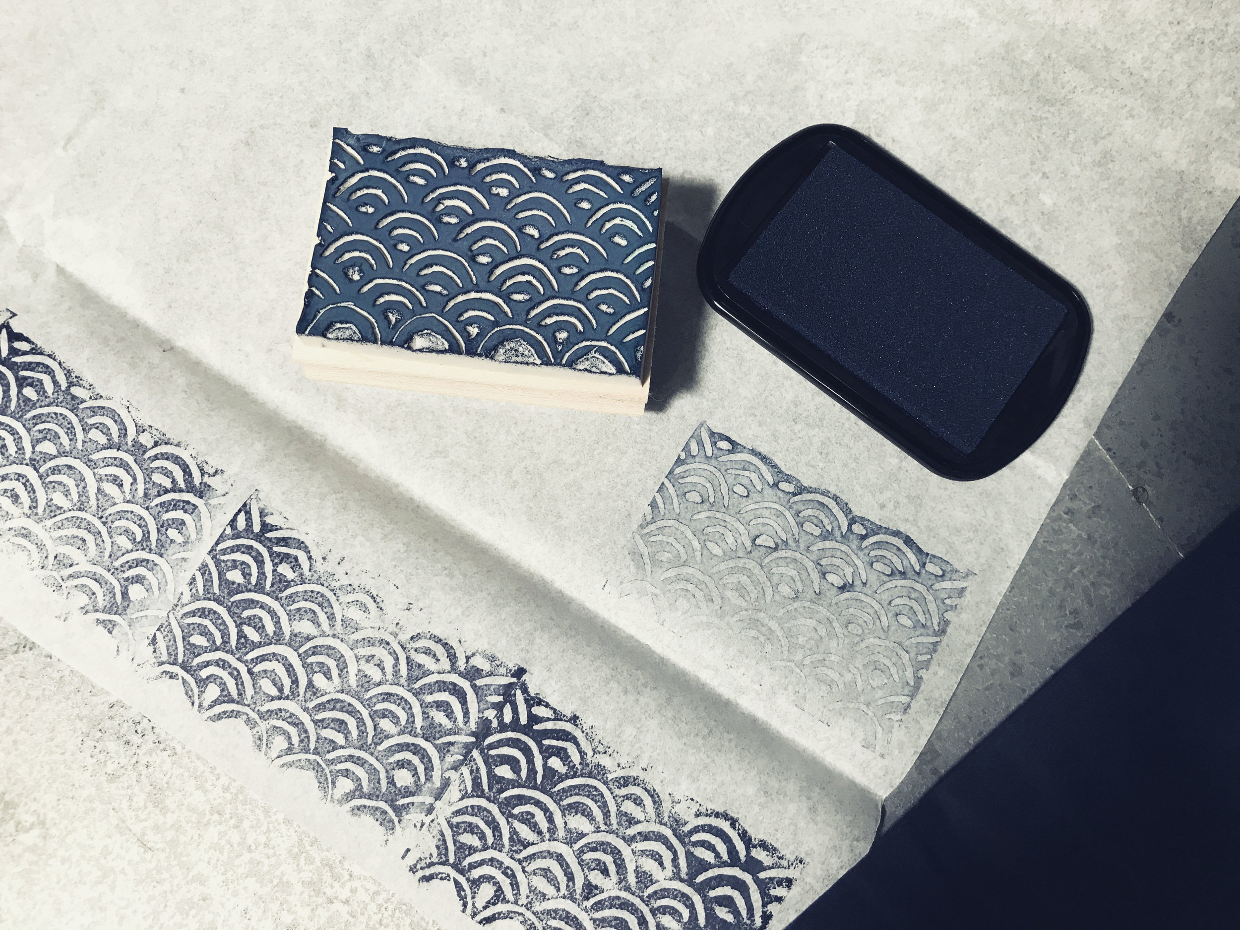
Navy ink on white tissue is reading better.

*Shadow box like this.

*Not shadow box like this.
For clarity.
But not bad for the first shot. Really liking how imperfect it feels, and I'm glad I decided to go this route than the vector perfect method–which I just don't like as much, even with everything else the same. I love the variation in lines, so that's a fun new thing.
I bought 2 stamps, so that means 3 more sides to experiment with. Thinking I'll do a thin line that can be used as a border, and one pattern that's good as a triangle corner piece of the tissue.
Excited to try some more ideas with the carving over the weekend. I will say, working with the rubber is a lot different than working with wood. It's squishier, so harder to control. Wood is more predictable, I feel. But very pleased with this 1st pass, so it can only get better from here.
Further reading and sources of the quotes above:
https://sweetpersimmon1.blogspot.com/2010/03/japanese-patterns-and-motifs.html
http://www.johnnytimes.com/japanese-patterns-traditional-motifs/
http://www.immortalgeisha.com/wiki/index.php?title=Seigaiha

